The Data Visualization Revolution: How to Make Your Data Come Alive

Imagine walking into an art gallery. Paintings, sculptures, and photographs hang on the walls, each telling a unique story. Some are abstract, evoking emotions and sparking imagination. Others are meticulously detailed, capturing the essence of reality. Data visualization serves a similar purpose. It transforms raw, often complex data into compelling visual narratives that are easy to understand and interpret.
Just as an artist carefully selects colors, shapes, and textures to convey a message, a data scientist chooses the right charts, graphs, and visualizations to effectively communicate insights. By translating data into visual representations, we can:
- Identify patterns and trends: Spot anomalies, outliers, and unexpected relationships that might be missed in raw data.
- Communicate complex information: Convey insights to a wider audience, including those without a strong statistical background.
- Tell a compelling story: Engage viewers and guide them through a narrative that highlights key findings.
- Support decision-making: Provide a visual foundation for informed decisions across various domains.
This article will explore the key principles and techniques of data visualization, guiding you through the process of creating impactful and informative visual representations of data.
What is Data Visualization?
Data visualization is the graphical representation of information and data. By using visual elements like charts, graphs, and maps, data visualization tools provide an accessible way to see and understand trends, outliers, and patterns in data.
Essentially, it’s the art of translating raw data into meaningful and easily understandable visual formats. Imagine a spreadsheet filled with numbers — it can be overwhelming and difficult to grasp the underlying story. Data visualization transforms this raw data into compelling visuals, such as bar charts, line graphs, scatter plots, and interactive dashboards, making it easier to identify trends, spot anomalies, and communicate insights effectively.
Key Goals of Data Visualization:
- Clarity: Make complex data understandable to a wider audience, including those without a strong statistical background.
- Communication: Effectively convey key findings and insights to stakeholders.
- Exploration: Discover hidden patterns, trends, and anomalies that might be missed in raw data.
- Decision Making: Support informed decision-making by providing a visual foundation for analysis and interpretation.
- Storytelling: Create engaging narratives that communicate the significance of data and its impact.
The Power of Visual Storytelling:
Just as a skilled storyteller uses words and imagery to weave a captivating narrative, data visualization uses visual elements to tell a compelling story with data. By carefully selecting the right visualizations and presenting them in a clear and concise manner, we can:
- Highlight key trends and patterns: Identify upward or downward trends, seasonal fluctuations, and unexpected outliers.
- Communicate complex relationships: Reveal correlations between different variables and understand how they interact.
- Compare and contrast data: Easily compare different groups, categories, or time periods.
- Engage and inspire: Capture attention, spark curiosity, and leave a lasting impression on the audience.
1. Choosing the Right Visualization:
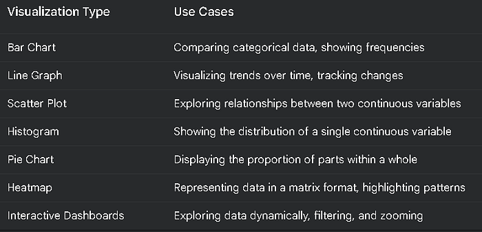
The choice of visualization depends heavily on the type of data and the message you want to convey. Some common visualization types include:
- Bar Charts: Ideal for comparing categorical data, such as sales across different regions or the frequency of different categories.
- Line Graphs: Effective for visualizing trends over time, such as stock prices, website traffic, or temperature changes.
- Scatter Plots: Used to explore relationships between two continuous variables, such as height and weight, or income and education level.
- Histograms: Show the distribution of a single continuous variable, revealing patterns like skewness and outliers.
- Pie Charts: Useful for displaying the proportion of different categories within a whole.
- Heatmaps: Represent data in a matrix format, with colors indicating the intensity or magnitude of values.
- Interactive Dashboards: Allow users to explore data dynamically, filtering, zooming, and interacting with visualizations.
2. Principles of Effective Visualization:
- Clarity: Visualizations should be clear, concise, and easy to understand. Avoid clutter and unnecessary details.
- Accuracy: Ensure that the visualizations accurately reflect the underlying data and avoid misleading interpretations.
- Relevance: Choose visualizations that are relevant to the specific questions being addressed and the key insights you want to convey.
- Aesthetics: While clarity is paramount, aesthetically pleasing visualizations can enhance engagement and improve the overall impact.
- Accessibility: Consider the needs of all users, including those with visual impairments, by providing alternative text descriptions and ensuring color contrast.
3. Creating Visualizations with Python:
Python offers a rich ecosystem of libraries for creating stunning visualizations. Matplotlib is a fundamental library for creating a wide range of static, interactive, and animated visualizations. Seaborn builds upon Matplotlib, providing a higher-level interface for creating attractive and informative statistical graphics.
import matplotlib.pyplot as plt
import seaborn as sns

# Sample data
tips = sns.load_dataset("tips")

# Create a bar plot of total bill by day
sns.barplot(x="day", y="total_bill", data=tips)
plt.title("Total Bill by Day")
plt.xlabel("Day of the Week")
plt.ylabel("Total Bill")
plt.show()
This code creates a simple bar plot using Seaborn, visualizing the average total bill amount for each day of the week in the “tips” dataset.
4. Storytelling with Data:
Beyond simply presenting data, effective visualizations tell a story.
- Start with a clear narrative: Define the key message you want to convey and structure your visualizations accordingly.
- Use a consistent visual style: Maintain a consistent color scheme, font style, and overall aesthetic throughout your visualizations.
- Guide the viewer’s attention: Use annotations, labels, and visual cues to highlight key findings and guide the viewer’s attention.
- Tell a story, not just show data: Use visualizations to create a compelling narrative that engages the viewer and leaves a lasting impression.
5. Interactive Data Visualization:
Interactive visualizations allow users to explore data dynamically, providing a more engaging and interactive experience.
- Dashboards: Create interactive dashboards that allow users to filter, zoom, and drill down into data, uncovering insights on demand.
- Interactive Maps: Visualize geographical data with interactive maps, allowing users to explore patterns and trends across different regions.
- 3D Visualizations: Create immersive 3D visualizations to explore complex datasets from multiple perspectives.
6. Ethical Considerations:
- Data Integrity: Ensure that the data used for visualization is accurate, reliable, and free from bias.
- Transparency: Be transparent about the data sources, methodology, and any limitations of the visualizations.
- Misleading Visualizations: Avoid using techniques that can mislead or deceive viewers, such as manipulating axes or using inappropriate chart types.
- Accessibility: Ensure that visualizations are accessible to all users, including those with disabilities.
Table: Common Data Visualization Techniques
Conclusion
In conclusion, data visualization is more than just a collection of charts and graphs; it’s a powerful tool for transforming raw data into meaningful narratives that can inform, inspire, and persuade. By effectively translating data into visual formats, we can unlock hidden insights, communicate complex information with clarity, and drive data-driven decision-making across various domains.
From simple bar charts to interactive dashboards, the choice of visualization techniques is crucial in effectively conveying the underlying message. By adhering to key principles like clarity, accuracy, and relevance, we can create visualizations that are not only informative but also visually appealing and engaging.
The rise of powerful visualization libraries like Matplotlib and Seaborn in Python has made it easier than ever to create stunning and informative visualizations. By leveraging these tools and embracing the principles of data storytelling, individuals and organizations can harness the power of data visualization to:
- Uncover hidden patterns and trends: Identify anomalies, outliers, and unexpected relationships that might be missed in raw data.
- Communicate complex information effectively: Convey insights to a wider audience, including those without a strong statistical background.
- Support informed decision-making: Provide a visual foundation for making data-driven decisions across various fields.
- Drive innovation: Foster creativity and inspire new ideas by visualizing data in novel and unexpected ways.
However, it’s crucial to remember that data visualization is not just about creating pretty pictures. Ethical considerations, such as data integrity, transparency, and the avoidance of misleading visualizations, are paramount. By ensuring that visualizations accurately reflect the underlying data and are presented in a responsible and ethical manner, we can build trust and maintain credibility.
As technology continues to evolve and data volumes continue to grow, the importance of effective data visualization will only increase. By embracing the art of data storytelling and leveraging the power of visualization tools, we can unlock the full potential of data and navigate the complexities of the information age with greater clarity and confidence.
Key Takeaways:
- Data visualization is the art of transforming raw data into meaningful and easily understandable visual formats.
- Effective visualizations are clear, accurate, relevant, and aesthetically pleasing.
- Data visualization can be used to uncover hidden patterns, communicate complex information, and support informed decision-making.
- Ethical considerations, such as data integrity and transparency, are crucial for effective and responsible data visualization.
- By mastering the principles and techniques of data visualization, we can unlock the full potential of data and drive innovation across various domains.